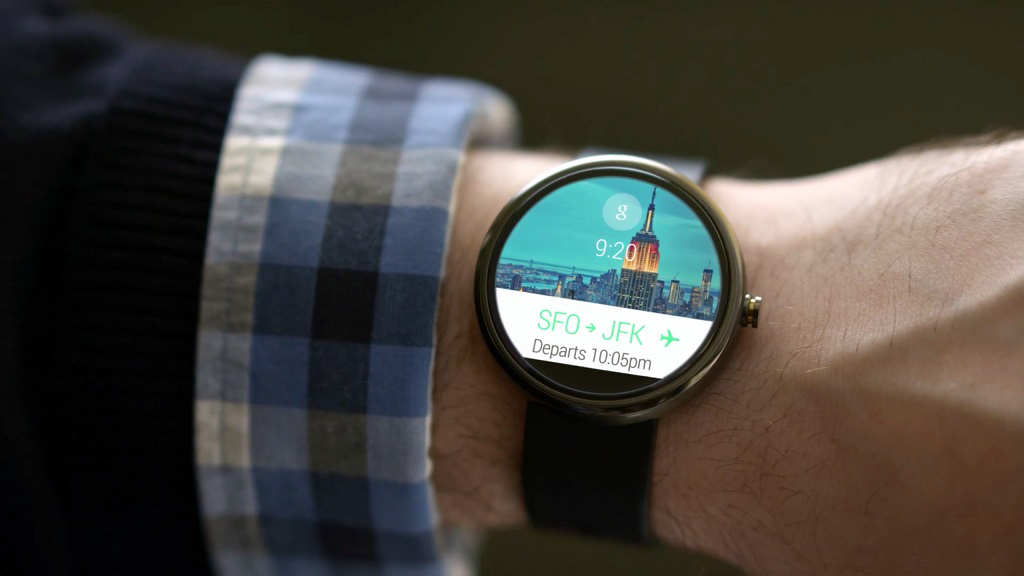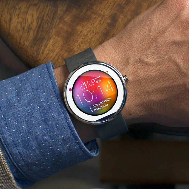
The new Moto 360 is what smart watches should be. It’s something beautiful, big & most importantly it matches the expectations of a wristwatch.
Moto 360 is come up with unique circular design . When you see it, you see something familiar with intriguing qualities, not some gadget that happens to fit on your wrist. The Moto 360 strikes a stunning pose on your wrist, particularly in its stainless steel (as opposed to black) garb. Fit and finish of the devices we saw was top notch. The chamfered edges of both the glass covering the screen and that metal housing lend it a luxurious look and feel, and the thick, split leather strap is premium, too.
The Moto 360 won’t go on sale until later this summer, and Motorola hasn’t announced a price. The unit I tried out at Google I/O was locked in retail mode, basically showing only sample cards but still interactive. I could swipe and tap on the notification cards, but they weren’t “real.”

The circular notifications worked just like the ones on the near-identical LG G Watch and Samsung Gear Live except there, you know, circles. Danger’s part of the game is when you’re fashion-forward.
And its fashion that makes the Moto 360 such a sensation. While the Android Wear smart watches from Samsung and LG are cute gadgets, Motorola’s smart watch is a piece of technology you covet. In that way it reminding me of what I felt when I first touched an iPad: It may do some useful things, but the feeling of desire went beyond having a convenience. What I wanted was a trophy.
Like LG and Samsung, Motorola had the 360 running a demo mode of Android Wear, so we couldn’t get a feel for how the watch actually will work. That said, Motorola’s on its way to proving that sometimes, it’s not hip to be a square !


